In B2B sales, raw data is just noise. The difference between hitting quota and missing targets often comes down to one thing: how quickly you can translate that data into decisive action. A well-designed sales dashboard is your command center, transforming complex CRM data, pipeline metrics, and team performance into a clear, actionable picture. Without it, you're navigating blind, reacting to problems instead of proactively shaping outcomes.
This guide moves beyond generic templates to provide a curated collection of powerful sales dashboard examples from industry-leading platforms like HubSpot, Salesforce, and Tableau. We're not just showing you what they look like; we're breaking down the strategic thinking behind each one.
For every example, you'll find:
- Deep-Dive Analysis: Why specific metrics are chosen and how they work together.
- Strategic Insights: The business questions each dashboard is built to answer.
- Actionable Takeaways: Replicable strategies you can apply to your own dashboards today.
We've included screenshots and direct links for each tool, so you can see them in action. This resource is designed for sales leaders, RevOps professionals, and anyone focused on optimizing their sales engine. Let's explore the dashboards that turn data into revenue.
1. HubSpot
HubSpot stands out as an all-in-one CRM platform where sales dashboards are not just an add-on but a core, integrated component of the sales process. Its strength lies in pulling real-time data directly from every customer interaction logged in the CRM, from email opens to deal stage changes. This creates a single source of truth, eliminating the data silos that often plague sales teams.
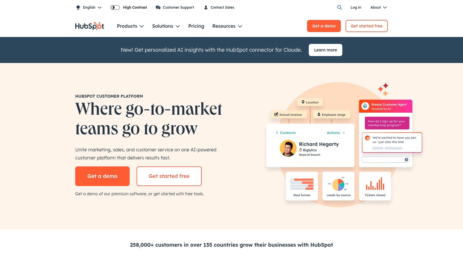
Unlike standalone BI tools, HubSpot’s dashboards are natively connected to its sales automation and marketing tools. This allows for unparalleled context. For instance, a "Deal Pipeline" widget doesn't just show numbers; it reflects the real-time status of deals being nurtured by automated email sequences. The user-friendly, drag-and-drop interface empowers even non-technical sales leaders to build custom reports, making it one of the most accessible and powerful sales dashboard examples for teams of all sizes.
Strategic Analysis
The primary strategic advantage of a HubSpot dashboard is its direct link to action. A sales manager can see a bottleneck in the "Appointment Scheduled" stage and immediately create a task or an automated follow-up sequence for reps to address it, all within the same platform.
Key Insight: HubSpot transforms the sales dashboard from a passive reporting tool into an active command center for sales operations. The true value is the seamless transition from data insight to sales action.
For teams focused on inbound success, these dashboards provide clear visibility into which marketing channels are generating the most qualified leads. This tight integration helps align sales and marketing efforts, ensuring resources are focused on high-performing activities. Exploring different CRM workflow examples can help unlock even more powerful automation directly from your dashboard insights.
Actionable Takeaways
- Implement an "Activity Leaderboard": Use the custom report builder to track calls, emails, and meetings logged per rep. This fosters friendly competition and highlights who may need coaching.
- Create a "Forecast vs. Quota" Dashboard: Combine deal forecast reports with quota attainment widgets. Set this as the default dashboard for your sales team to keep goals top-of-mind.
- Use Pre-Built Templates: Start with HubSpot's pre-built sales templates like "Sales Performance" and "Deal Funnel" to get immediate insights, then customize them by adding or removing reports specific to your KPIs.
For a deeper dive into maximizing the HubSpot platform for comprehensive business growth, including sales and marketing, explore this comprehensive guide to growing your business with HubSpot. The platform is available through tiered subscription plans, starting with a free CRM and scaling up to enterprise-level packages.
2. Geckoboard
Geckoboard specializes in making data highly visible and easily digestible, positioning itself as a dedicated dashboarding tool built for team transparency. Its core philosophy is to pull key metrics from various sources and display them in real-time on large screens, effectively turning sales data into a public, motivational scoreboard. It excels at connecting to a wide array of data sources, including CRMs like Salesforce and Pipedrive, spreadsheets, and databases, via its 90+ pre-built integrations.
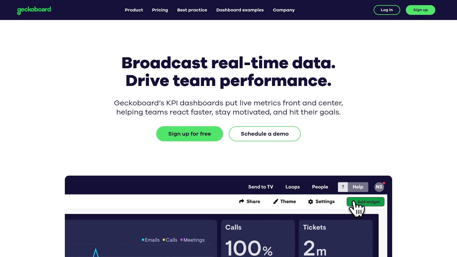
Unlike all-in-one CRM platforms, Geckoboard’s strength is its focused simplicity. The drag-and-drop interface allows anyone to build a visually compelling dashboard in minutes without needing technical expertise. This focus on ease of use and visual clarity makes it one of the best sales dashboard examples for teams that want to foster a data-aware culture and keep everyone aligned on critical KPIs, from individual quota attainment to overall team pipeline health.
Strategic Analysis
The strategic power of Geckoboard lies in its ability to create a shared consciousness around team performance. By displaying live dashboards in a central office location, it gamifies the sales process and holds everyone accountable to the same goals. A sales leaderboard isn't just a report in an inbox; it’s a dynamic, public display that updates with every closed deal.
Key Insight: Geckoboard transforms sales metrics from isolated data points into a source of collective motivation and immediate feedback. Its value is in making performance visible, immediate, and shared.
For sales leaders, this constant visibility removes the need to constantly ask for status updates. Reps can see exactly where they stand against their targets and peers, encouraging self-management and a proactive approach to hitting their numbers. This is particularly effective for high-velocity sales teams where activity metrics are a strong indicator of future success.
Actionable Takeaways
- Broadcast a "Deals Closed This Month" Leaderboard: Use a large TV on the sales floor to display a real-time leaderboard connected to your CRM. This simple visualization can dramatically increase friendly competition and motivation.
- Build a "Pacing to Target" Dashboard: Combine widgets showing current monthly recurring revenue (MRR) against the monthly goal. Use Geckoboard’s goal-setting features to show a progress bar that turns green or red based on performance.
- Create a "Key Activity Metrics" View: Dedicate a dashboard to leading indicators like calls made, demos booked, and new opportunities created. This keeps the team focused on the daily activities that drive long-term results.
Geckoboard offers several pricing tiers, starting with a free plan for a single user and one dashboard, and scaling to team and company plans that support more users, dashboards, and advanced sharing options. You can explore its features and pricing at https://www.geckoboard.com/.
3. Klipfolio
Klipfolio positions itself as a powerful, dedicated business intelligence (BI) platform, focusing on supreme data connectivity and customization. Its core strength lies in its ability to connect to over 100 data services, allowing sales teams to pull metrics from disparate sources like their CRM, accounting software, and marketing automation tools into a single, unified view. This makes it ideal for organizations with complex tech stacks that need to consolidate data without being locked into one ecosystem.
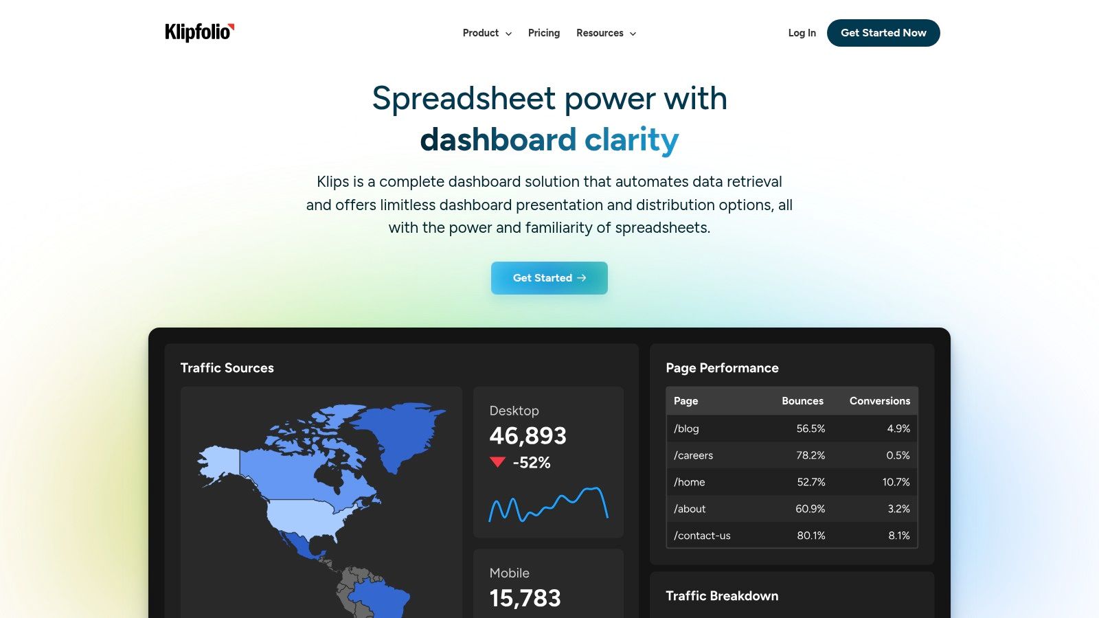
Unlike integrated CRM dashboards, Klipfolio offers a level of granularity and formulaic control that appeals to data-savvy teams. While it has a steeper learning curve compared to plug-and-play solutions, this complexity is its advantage. It empowers users to build highly specific calculations and visualizations that might not be possible in a standard CRM. This flexibility makes it one of the best sales dashboard examples for teams that need to blend sales data with financial, operational, or marketing KPIs for a holistic business overview.
Strategic Analysis
The primary strategic benefit of Klipfolio is its role as a data aggregator and centralizer. For a sales leader, this means you can place a "Sales Qualified Leads" metric from your marketing platform directly next to a "Closed Won Deals" metric from your CRM and an "Average Revenue Per User" metric from your billing system. This cross-platform visibility helps identify direct correlations between marketing spend, sales activity, and actual revenue.
Key Insight: Klipfolio transforms data from multiple silos into a cohesive strategic narrative. It moves beyond just sales activity to show how sales performance impacts and is influenced by the entire business.
This approach is particularly valuable for revenue operations (RevOps) professionals. They can build dashboards that track the entire customer lifecycle, from initial ad click to final renewal payment, providing a complete picture of pipeline health and revenue predictability that would be difficult to assemble otherwise.
Actionable Takeaways
- Create a "Blended Data" Dashboard: Start with a pre-built template and connect at least three sources: your CRM (e.g., Salesforce), a marketing tool (e.g., Google Analytics), and a financial tool (e.g., QuickBooks). Track a lead's journey across all three.
- Utilize Custom Formulas for Predictive Metrics: Go beyond standard reports by using Klipfolio’s editor to create a "Likely to Close" score. Combine metrics like lead source, number of interactions, and deal age into a custom formula to prioritize efforts.
- Set Up Real-Time TV Dashboards: Use the sharing features to display key sales dashboards on office TVs. Focus on real-time metrics like "Leads Today," "Meetings Booked," and "Leaderboard" to create an energetic and data-driven sales floor.
You can learn more and explore pricing options, which range from a free plan for individual use to scalable business tiers, directly on the Klipfolio website.
4. Pipedrive
Pipedrive is a sales-first CRM built by and for salespeople, and its dashboard functionality directly reflects this focused philosophy. Its primary strength is its highly visual and intuitive representation of the sales pipeline. The platform treats the dashboard not as a separate analytics module but as the central, interactive hub where sales activities are tracked and managed in real-time. This makes it exceptionally effective for activity-based selling methodologies.
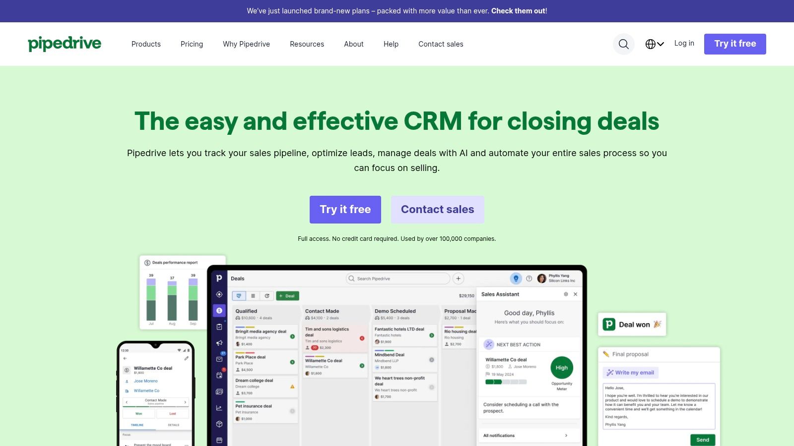
Unlike more complex, all-in-one platforms, Pipedrive’s dashboards are designed for immediate clarity and action. The interface centers on deal progress, clearly visualizing how many deals are in each stage, their value, and their "rotting" time. This visual-first approach empowers reps to own their pipeline and managers to spot bottlenecks instantly, making it one of the most user-friendly sales dashboard examples for teams that prioritize pipeline velocity and clear, actionable metrics over deep, multi-departmental analytics.
Strategic Analysis
The core strategic value of a Pipedrive dashboard lies in its ability to drive accountability and proactive sales behavior. By visualizing "deal rotting" (deals that have been idle in a stage for too long), the dashboard creates a sense of urgency. A manager can quickly identify which deals are at risk and guide reps on the next best action, directly from the dashboard view.
Key Insight: Pipedrive turns the sales pipeline into a dynamic and gamified dashboard, focusing the team on the essential activities that move deals forward. Its value is in its simplicity and direct correlation between visual cues and required sales actions.
This focus on activity management is a powerful tool for coaching. Managers can compare rep-specific dashboards to see who excels at moving deals through certain stages and who might need support, enabling targeted training. For teams looking to maximize output, understanding these activity metrics is crucial; discovering new ways for how to improve sales productivity becomes a data-driven exercise.
Actionable Takeaways
- Set Up "Deal Rotting" Alerts: In your pipeline settings, define the maximum number of days a deal can sit in each stage before it "rots." This feature will automatically flag stalled deals on the dashboard in red.
- Create an "Activity-to-Conversion" Report: Build a custom report that tracks the number of calls, emails, and meetings logged against the number of deals won. This helps identify the most effective sales activities for your team.
- Use the "Live Dashboard" on a Team Screen: Display a live version of the main sales dashboard on a monitor in the office. This keeps team goals, leaderboards, and progress visible, fostering a competitive and goal-oriented environment.
Pipedrive is offered through tiered subscription plans, starting with the Essential plan and scaling to the Enterprise level, with most dashboard customization features available in the Advanced and higher tiers. You can learn more at https://www.pipedrive.com/.
5. Tableau
Tableau is a premier data visualization and business intelligence platform that empowers sales organizations to go beyond standard reporting. Its core strength is the ability to connect to virtually any data source, from spreadsheets and SQL databases to complex cloud data warehouses like Snowflake or Amazon Redshift. This allows teams to blend sales data with information from finance, marketing, and operations to create a truly holistic view of business performance.
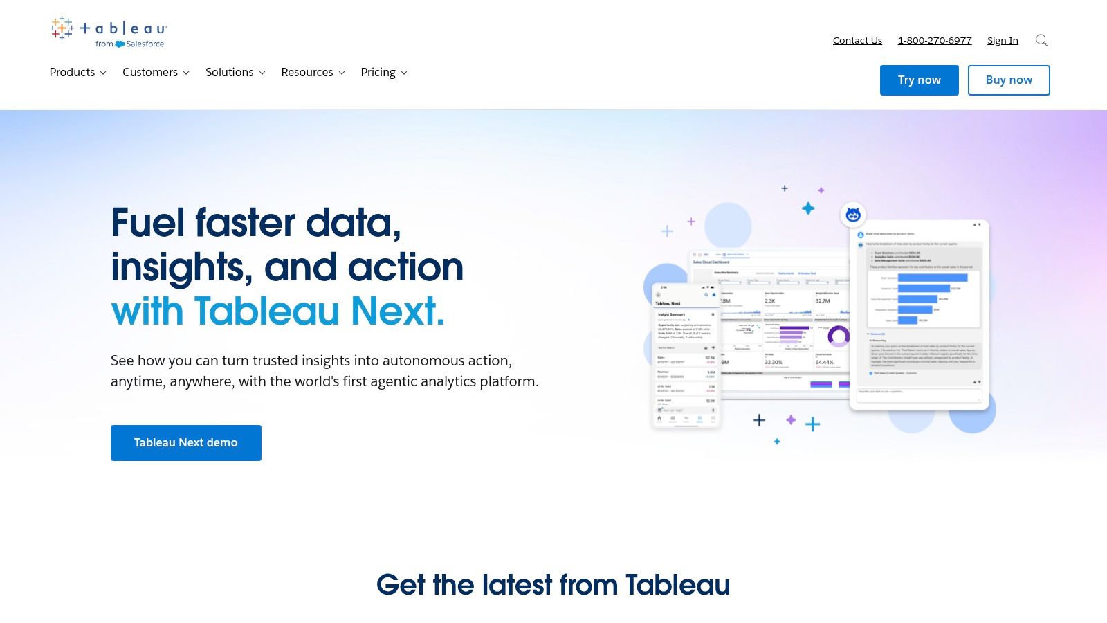
Unlike CRM-native dashboards, Tableau is data-agnostic, prioritizing analytical depth and visualization flexibility above all else. Its drag-and-drop interface is deceptively simple, hiding a powerful analytics engine capable of complex calculations, statistical analysis, and predictive modeling. This makes it an ideal choice for data-driven sales teams that need to answer complex questions that go beyond simple activity tracking, making its dashboards some of the most insightful sales dashboard examples available.
Strategic Analysis
The strategic power of Tableau lies in its ability to facilitate deep-dive analysis and uncover hidden trends. A sales leader can use its interactive features to drill down from a high-level regional sales number to an individual representative’s performance, and then filter by product line or customer segment, all within the same dashboard view. This empowers leaders to move from "what happened?" to "why did it happen?".
Key Insight: Tableau turns a sales dashboard into an interactive analytical workspace. Its value is not just in presenting data, but in enabling a dynamic, exploratory approach to sales strategy and forecasting.
For organizations with complex sales cycles or multiple product lines, Tableau can map intricate customer journeys and attribute revenue with precision. By blending CRM data with web analytics and marketing automation data, a team can visualize the entire funnel and identify points of friction or opportunity that a single-platform tool might miss.
Actionable Takeaways
- Build a Geographic "Heat Map": Connect your sales data with geographic fields (zip codes, states) to create a visual map of sales concentration. Use this to identify underserved markets or areas with high growth potential.
- Create a "Win/Loss Analysis" Dashboard: Combine opportunity data with custom fields detailing reasons for wins and losses. Use filters to analyze why deals are lost by competitor, region, or deal size to refine your sales pitch and strategy.
- Implement Predictive Forecasting: Use Tableau's built-in forecasting functions on your historical sales data. This creates a statistically-driven forecast to compare against the pipeline-based forecast from your CRM, providing a more robust picture of future revenue.
Tableau offers several product tiers, from Tableau Viewer for consuming dashboards to Tableau Creator for building them. Pricing is subscription-based, per user, which can be a significant investment but is justified for teams that require advanced analytical power. You can learn more at https://www.tableau.com/.
6. Zoho Analytics
Zoho Analytics carves out its niche as a powerful, dedicated business intelligence (BI) platform that offers deep customization for sales reporting. Its core strength is its ability to connect and blend data from a vast array of sources, not just a native CRM. This allows teams to create a comprehensive sales dashboard that incorporates data from marketing platforms, finance software, and even custom databases, providing a truly holistic view of performance.
Unlike integrated CRM dashboards that are confined to their own ecosystem, Zoho Analytics provides the flexibility to build from the ground up. It features a user-friendly drag-and-drop interface, but its real power lies in its AI-powered assistant, Zia, which can answer natural language questions (e.g., "show me sales by region for last quarter") and automatically generate the corresponding reports. This makes complex data exploration accessible, positioning it as one of the best sales dashboard examples for data-driven teams that need to look beyond just sales activity metrics.
Strategic Analysis
The key strategic advantage of Zoho Analytics is its capacity for cross-functional data synthesis. A sales manager can build a dashboard that not only tracks deal velocity but also overlays marketing campaign spend and customer support ticket data for key accounts. This reveals deeper correlations, such as how specific marketing campaigns influence not just lead generation but also deal size and long-term customer satisfaction.
Key Insight: Zoho Analytics turns the sales dashboard from a departmental report into a central business intelligence hub. Its value is in unifying disparate data sets to uncover strategic insights that would otherwise remain siloed.
For organizations leveraging the broader Zoho ecosystem (Zoho CRM, Zoho Books, etc.), the integration is seamless and powerful. However, its true value is for companies wanting to blend Zoho data with external sources like Salesforce or Google Ads. This enables a level of analysis that can directly inform resource allocation, sales territory planning, and product development priorities based on sales trends.
Actionable Takeaways
- Utilize the AI Assistant: Encourage your team to use Zia for ad-hoc queries. This empowers sales reps to get quick answers without needing a data analyst, speeding up decision-making.
- Build a Profitability Dashboard: Go beyond revenue by blending sales data from your CRM with cost data from your accounting software. Track metrics like "Profit per Sale" or "Customer Acquisition Cost vs. Lifetime Value" for a more complete financial picture.
- Leverage Pre-Built Templates: Zoho offers over 50 pre-built dashboards for various platforms, including Salesforce and HubSpot. Start with these templates to get immediate value, then customize them by adding widgets specific to your team's unique KPIs.
Zoho Analytics offers a range of subscription tiers, including a free plan for basic use, making it accessible for businesses of all sizes. For more details on its capabilities and pricing, visit the official Zoho Analytics website.
7. Salesforce
Salesforce is the heavyweight champion of CRM, and its sales dashboard capabilities are a direct reflection of its power and depth. Its core strength lies in its ability to centralize vast amounts of data from sales, service, and marketing clouds into highly customizable, real-time dashboards. This creates an unparalleled 360-degree view of the customer and the entire sales lifecycle, from lead generation to post-sale support.
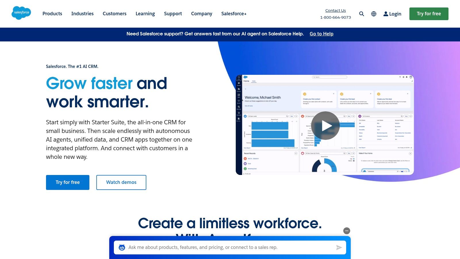
Unlike many CRMs with rigid reporting, Salesforce offers a nearly limitless canvas for data visualization. Its dashboards are built from underlying reports that can be sliced, diced, and filtered with granular precision. This allows organizations to move beyond standard KPIs and track highly specific metrics unique to their business model, making it one of the most powerful and adaptable sales dashboard examples available for enterprise-level teams that demand deep analytical control.
Strategic Analysis
The strategic advantage of Salesforce dashboards is scalability and customization. As a business grows, its processes and data needs become more complex. Salesforce is built to handle this complexity, allowing teams to create layered dashboards that serve different strategic purposes, from high-level executive summaries of global performance to granular, rep-level activity tracking.
Key Insight: Salesforce transforms data into a strategic asset. Its dashboards are not just for monitoring performance; they are for deeply understanding the cause-and-effect relationships within your sales process at scale.
This level of detail is crucial for optimizing complex go-to-market strategies. For example, a team can analyze pipeline velocity by lead source, region, and product line simultaneously, uncovering hidden inefficiencies that simpler tools would miss. This aligns perfectly with the goal of refining operations, and understanding core sales operations best practices is key to leveraging these powerful insights effectively.
Actionable Takeaways
- Build a "Pipeline Health" Dashboard: Combine reports showing deal age in stage, deal push-count (how many times a close date has been moved), and open activities per opportunity. This provides a leading indicator of pipeline risk.
- Utilize Dynamic Dashboards: Set up a single "My Performance" dashboard and configure it as a dynamic dashboard. This allows each user to see the same reports but filtered automatically to show only their own data, saving time on report creation.
- Create a "Lead Source ROI" Dashboard: Track the journey from lead creation to closed-won deals, grouped by lead source. Compare this against marketing spend to calculate the true return on investment for each channel.
Salesforce's platform is available through a tiered subscription model, beginning with its Sales Cloud "Starter" package and scaling up to highly customized enterprise solutions. Its robust nature often involves a higher cost and a steeper learning curve, but the investment pays off for teams needing deep, scalable analytics.
Sales Dashboard Tools Feature Comparison
| Platform | Implementation Complexity 🔄 | Resource Requirements ⚡ | Expected Outcomes 📊 | Ideal Use Cases 💡 | Key Advantages ⭐ |
|---|---|---|---|---|---|
| HubSpot | Moderate - user-friendly, some setup | Medium - requires commitment, integrations | Real-time sales insights and automation | Sales teams seeking integrated CRM dashboards | Customizable dashboards, extensive app integration |
| Geckoboard | Low - drag-and-drop setup | Medium - cost increases with dashboards | Real-time KPI visibility to boost team motivation | Teams wanting visual dashboards on large screens | Easy setup, strong team transparency |
| Klipfolio | Moderate to high - some learning curve | Medium to high - costs for advanced features | Effective real-time tracking and collaboration | Sales teams needing customizable BI dashboards | Highly customizable, extensive data source support |
| Pipedrive | Low - intuitive interface | Medium - integration with many apps | Streamlined sales pipeline management | Sales teams focusing on pipeline and communication | User-friendly, highly customizable |
| Tableau | High - requires training | High - premium pricing | Detailed, interactive dashboards with analytics | Enterprises needing advanced analytics | Powerful analytics, predictive capabilities |
| Zoho Analytics | Low to moderate - drag-and-drop ease | Low to medium - affordable pricing | Simplified dashboard creation with AI help | Companies needing affordable BI with AI assistance | AI-powered analysis, user-friendly |
| Salesforce | High - steep learning curve | High - premium pricing | Comprehensive CRM insights with forecasting | Large organizations needing robust CRM & analytics | Powerful analytics, broad integrations |
Build a Dashboard That Drives Revenue, Not Just Reports
We've explored a powerful collection of sales dashboard examples from industry-leading platforms like Salesforce, HubSpot, and Tableau. Each one offers a unique lens through which to view your sales performance, but the ultimate goal remains the same: to move beyond passive reporting and create an active, revenue-driving command center for your team. A well-designed dashboard doesn't just display data; it tells a story, highlights opportunities, and triggers immediate action.
The key takeaway is that the "best" dashboard isn't a one-size-fits-all template. It’s a dynamic tool tailored to your specific sales cycle, team structure, and business objectives. As we saw with Pipedrive's activity-focused layout and Tableau's deep customization, the most effective dashboards align directly with the behaviors you want to encourage.
Key Takeaways and Actionable Next Steps
To transform these examples into a functional tool for your own team, focus on these core principles:
- Prioritize Leading Indicators: While tracking closed-won deals is essential, your dashboard should heavily feature leading indicators. These are the daily and weekly activities that predict future success, such as calls made, demos booked, and new opportunities created. This proactive approach allows you to course-correct before you miss your quota.
- Define Your "One Metric That Matters" (OMTM): For each sales role, what is the single most important metric they should focus on? For an SDR, it might be "qualified meetings booked." For an Account Executive, it could be "pipeline velocity." Build your dashboards around these central KPIs to create clarity and focus.
- Embrace Segmentation: Don't settle for a single, monolithic view of your sales data. The most insightful sales dashboard examples we reviewed offer powerful segmentation. Analyze performance by region, by lead source, by individual rep, or by product line to uncover hidden trends and diagnose issues with precision.
Choosing and Implementing the Right Tool
Selecting the right platform is a critical step. Your choice should be guided by your technical resources, budget, and integration needs.
Consider these factors during your evaluation:
- Integration Capabilities: Does the tool connect seamlessly with your CRM and other essential software? A dashboard that requires constant manual data entry will quickly be abandoned. Platforms like Geckoboard and Klipfolio are built for easy integration.
- Customization vs. Simplicity: Do you need the infinite flexibility of a tool like Tableau or Zoho Analytics, or would a more straightforward, out-of-the-box solution like Pipedrive better suit your team? Be realistic about the time and expertise you can dedicate to setup and maintenance.
- User Adoption: The most advanced dashboard is useless if your team doesn't use it. Involve your sales reps in the design process. Ask them what information they need to see daily to be more effective. A dashboard built for them is more likely to be adopted by them.
As you explore new ways to visualize performance, remember that the technology landscape is always evolving. When evaluating new tools to enhance your reporting, consider innovations like the new Mindstamp Insights Dashboard, designed to provide deeper analytics. Ultimately, your goal is to empower your team with clear, actionable data that makes their jobs easier and more productive. Start with one of the sales dashboard examples we've detailed, customize it for your needs, and build a culture of data-driven decision-making that fuels consistent growth.
Is your team struggling to route and assign leads from your marketing forms to the right reps instantly? Distro connects your forms directly to your sales team's calendar, automating the lead routing and scheduling process. Check out Distro to see how you can stop losing valuable leads and start converting them into meetings in seconds.