
Lead capture forms are those digital handshakes that turn anonymous website visitors into real, qualified prospects. These are the web forms—everything from a simple newsletter sign-up to a detailed demo request—designed to gather contact information and kickstart a relationship with a potential customer.
Getting these forms right isn't just a design task; it's a fundamental part of your growth strategy.
Why Your Growth Depends on Better Lead Capture Forms
Let's be honest. Most lead capture forms feel like an afterthought—a necessary but dull part of a webpage. But what if that simple form is the single biggest bottleneck in your entire growth model? It's time to stop seeing forms as just data fields and start treating them as the most critical first impression you can make.
Every single interaction with a form is a moment of truth. A potential customer has shown interest, found your page, and is thinking about taking the next step. This is where the magic—or the tragedy—happens. A clunky, confusing, or overly demanding form sends valuable prospects clicking away, driving up your customer acquisition costs and gumming up your sales pipeline.
The Strategic Value of a High-Converting Form
The best-performing companies get this. They don't just build forms; they engineer experiences. They know that a well-designed form builds immediate trust and makes the value exchange feel completely effortless for the user. This isn't about aesthetics—it's about real, measurable business impact.
Think about the straight line connecting form abandonment to your bottom line:
- Higher Conversion Rates: Even tiny tweaks can lead to huge lifts in submissions, directly pumping more leads into your pipeline.
- Lower Acquisition Costs: By converting more of the traffic you already have, you bring down the cost of acquiring each new lead.
- Increased Sales Velocity: A great form captures qualified, high-intent leads, letting your sales team engage faster and close deals sooner.
This isn't just a theory; it's backed by market trends. The lead capture software market is booming, projected to grow from $2.69 billion in 2024 to $4.55 billion by 2029. This explosion is fueled by the intense competition online and the need for more personalized marketing, proving that smart businesses are investing heavily in this crucial touchpoint.
A submitted form is so much more than just data; it's a declaration of interest. Treating it as a strategic asset, not just a technical requirement, is what separates the high-growth companies from everyone else.
Core Form Elements and Their Conversion Impact
Here's a quick look at the form components that matter most and how small tweaks can yield significant conversion lifts.
| Form Element | Best Practice | Impact on Conversion |
|---|---|---|
| Number of Fields | Ask for the minimum required. Can you get by with just an email for the first step? | Fewer fields almost always lead to higher conversions. |
| CTA Button Text | Be specific and value-driven (e.g., "Get My Free Guide" vs. "Submit"). | Clear, benefit-oriented CTAs can increase submissions by 20% or more. |
| Labels & Placeholders | Use clear, top-aligned labels. Use placeholders for examples, not as labels. | Reduces cognitive load and speeds up completion. |
| Error Messages | Display inline, real-time validation that's helpful, not accusatory. | Good error handling prevents frustration and form abandonment. |
| Social Proof | Add a small testimonial or stat near the CTA (e.g., "Join 50,000+ subscribers"). | Builds trust and reduces hesitation at the final moment. |
Mastering these core elements is the first step toward building a form that doesn't just collect information, but actively persuades users to complete it.
From Chore to High-Leverage Tool
The goal is to stop seeing lead capture forms as a chore and start recognizing them as the highest-leverage tool in your marketing arsenal. A few thoughtful changes can create a ripple effect across your entire business, boosting everything from marketing ROI to sales team morale.
To truly squeeze every drop of value from your lead capture efforts, it's worth exploring effective Shopify conversion rate optimization strategies, as the principles of reducing friction and clarifying value are universal. This guide will walk you through exactly how to turn your forms from passive data collectors into active drivers of business growth.
Designing Forms That People Actually Want to Complete

Are your form completion rates tanking? The problem often isn't the offer; it's the experience. A clunky, poorly designed form feels like a chore, creating friction that sends potential leads running for the hills. The real secret to higher conversions is buried in user experience (UX) principles that make filling out your lead capture forms feel completely effortless.
It all boils down to minimizing cognitive friction—the mental gymnastics required to complete a task. Every extra field, confusing label, or awkwardly placed button adds to that friction. Your job is to create a path of least resistance from the moment someone lands on your form to the second they hit "submit."
The first rule of thumb? Only ask for what you absolutely need. If you're after a newsletter sign-up, do you really need their first name right away? Probably not. An email address is plenty to kick things off. For something more involved, like a demo request, more information is fair game, but the core idea holds true: respect the user's time.
Guide the User with Visual Hierarchy
Great design is more than just aesthetics; it's about telling the user's eye where to go. Visual hierarchy uses design cues to signal importance and create a natural flow, showing a user exactly what to do next without them even having to think about it.
Here’s how to build a clear visual path:
- Whitespace is your best friend. Don't cram everything together. Generous spacing around form fields makes the whole thing feel less intimidating and much easier to scan. Clutter just breeds confusion.
- Font choices matter. Stick to a clean, legible font. Play with size and weight to create a clear distinction between headlines, field labels, and any instructional text. A bigger, bolder headline with standard-weight labels usually does the trick.
- Use color to direct attention. Color is your secret weapon for making the most important element pop: the call-to-action (CTA) button. A high-contrast color makes that button impossible to miss, signaling it as the final, rewarding step.
When you arrange these elements with care, you create a visual story that pulls the user smoothly toward completion. They won’t get lost or frustrated, because the design itself is showing them the way. To see these principles in action, check out the breakdown of top-tier examples in our extended guide to the lead capture form.
A user should never have to guess what to do next. An effective form design anticipates their questions and provides clear visual cues, making the submission process feel like a simple, logical conclusion rather than a complex task.
The Psychology of Form Trust and Motivation
Hitting "submit" is an act of trust. Someone is handing over their personal information, and they need to feel confident you'll handle it responsibly. Weaving trust signals directly into your form's design isn't just a nice-to-have; it's non-negotiable for boosting conversions.
Put these signals where they count. A simple link to your privacy policy right under the email field can do wonders to reassure users. Security badges or seals of approval are also powerful, especially if you're asking for more sensitive data. These small touches have a massive psychological impact.
Beyond trust, you have to keep them motivated. Your value proposition shouldn't just live on the landing page—it needs to be reinforced on the form itself. Remind the user why they're taking the time to fill this out.
| Element | Purpose | Real-World Example |
|---|---|---|
| Headline | Reinforce Value | "Get Your Free Marketing Plan" |
| Sub-headline | Add Specificity | "Tell us a bit about your business, and we'll email you a custom 5-page plan." |
| CTA Button | Confirm the Outcome | "Send My Free Plan" |
This kind of micro-copy frames the interaction as a fair exchange of value, not a one-sided data grab.
Finally, think about the experience in different contexts. For longer forms, break them up into smaller, bite-sized pieces with a multi-step form. This plays on the psychological principle of commitment—once someone completes the first step, they're far more likely to see it through to the end. Pair this with real-time validation, like a little green checkmark appearing next to a correctly filled field. This positive feedback reduces errors and makes the process feel seamless and rewarding. And, of course, a mobile-first approach is critical; your forms have to be just as easy to complete on a phone as they are on a desktop.
Choosing Your Form Fields: The Classic Battle of Conversion vs. Qualification
Every marketer knows the feeling. You're staring at your form builder, caught in the classic tug-of-war: ask for less to get more leads, or ask for more to get better leads? This tension between volume and quality is where a lot of lead gen strategies break down.
But here’s the thing: it’s a false choice. You don't have to sacrifice one for the other.
The secret is to be intentional. You need to strike a deliberate balance based on what each specific form is trying to accomplish. A form for a top-of-funnel ebook download serves a completely different purpose than one for a bottom-of-funnel demo request. Your fields have to reflect that.
Define Your "Must-Haves" vs. "Nice-to-Haves"
First things first, you need to get your sales and marketing teams in a room to end the internal debate. The goal is to define what information is absolutely essential for your sales team to qualify and follow up effectively. Everything else is just noise.
This conversation is about separating the critical data points from the merely interesting ones. You're building a list of non-negotiable fields that a lead must have to even be considered "sales-ready."
Here's how you can frame that discussion:
- Basic Qualification: What’s the bare minimum you need to see if a lead fits your Ideal Customer Profile (ICP)? This is usually stuff like company size, industry, or maybe a job title.
- Routing: What data do you need to get the lead to the right person, fast? This is often territory-based (like State or Country) or a specific product interest.
- Outreach Context: What nugget of information helps a rep nail their first touchpoint? A "biggest challenge" field can be pure gold here.
If a field doesn't fit into one of these buckets, it's probably a "nice-to-have." These are the fields that create friction and can almost always be gathered later on.
Don't let your forms become a data-hoarding exercise. Every single field you add must justify its existence by directly helping your sales team qualify, route, or personalize their outreach. If it doesn't serve one of those functions, cut it.
Use Progressive Profiling to Get Smarter Over Time
You don’t need to ask for everything all at once. This is where progressive profiling—a killer feature in most modern marketing automation platforms—really changes the game. It lets you build a rich profile of your leads over multiple interactions, starting with a short, low-friction form.
The idea is simple. If you already have a lead's name and email, your form can be smart enough to ask for something new the next time they visit. On their first visit for a whitepaper, you might ask for their company name. When they come back for a webinar, the form could ask for company size instead. This approach respects their time and dramatically reduces that initial hesitation to fill out a form.
This isn't just a "nice-to-have" strategy. With lead generation being a top priority for about 50% of marketers who pull in nearly 1,900 leads per month on average, efficiency is everything. When the average cost per lead is floating around $198, you have to make every interaction count to protect your ROI.
Real-World Examples and Choosing the Right Field Types
The type of field you choose is just as important as the information you're asking for. Making the right choice can be the difference between getting clean, usable data and a messy spreadsheet.
| Scenario | Poor Choice (High Friction) | Better Choice (Low Friction) | Why It Works Better |
|---|---|---|---|
| Industry | Open-text field | Dropdown menu with pre-defined options | Prevents messy, inconsistent data (e.g., "Tech" vs. "Technology") and is faster to complete. |
| Company Size | Open-text field | Radio buttons with ranges (e.g., 1-10, 11-50) | Simplifies the choice for the user and ensures the data is structured for your CRM. |
| Phone Number | Required field on a first-touch form | Optional field or not included at all | Asking for a phone number too early can slash conversion rates. It’s a high-commitment ask. |
Understanding the right moment to ask for certain information is an art. To make these qualified leads even more valuable, it's smart to implement a system that scores them based on the data they provide. You can dive deeper into our complete guide on lead scoring best practices to see how to assign value to different data points and actions.
Ultimately, a smart combination of lean initial forms, progressive profiling, and data enrichment tools is what allows you to get the best of both worlds: high conversion rates and deeply qualified leads.
Automating Your Post-Submission Workflow
Getting a lead to fill out your form isn't the finish line—it's the starting gun. The few seconds right after they hit "submit" are your single biggest opportunity to make a real impact. If you're relying on manual follow-up, you're setting yourself up for missed chances and cold leads. The real goal is to build a seamless, automated workflow that engages prospects the moment they show interest.
This whole process kicks off by connecting your forms to the rest of your tech stack. A well-integrated system makes sure the valuable data you just collected doesn't just die in a spreadsheet somewhere. It needs to flow instantly into your CRM and marketing automation platform, creating a single source of truth for every single new lead. This hookup gets rid of manual data entry, which is not only painfully slow but a prime suspect for costly errors.
Once you have that foundation, you can stop just collecting data and start managing leads intelligently.
Establishing Intelligent Lead Routing
In sales, speed is everything. A lead who has to wait hours—or worse, days—for a response is probably already on the phone with your competitor. Intelligent lead routing is the engine that gets every new prospect assigned to the right salesperson in seconds, not hours.
This isn't about a basic round-robin toss-up. A truly solid system, like what you can build with Distro, lets you create smart rules that route leads based on the data they just gave you in the form:
- Territory: Automatically send leads from a specific state or country straight to the regional sales rep who owns that patch.
- Company Size: Funnel enterprise-level leads to your senior account executives, while your SMB team gets the prospects that fit their focus.
- Product Interest: If your form asks which product someone's curious about, you can route them directly to a product specialist who can speak their language.
By automating this handoff, you shrink lead response time from hours to mere moments. This ensures you're striking while the iron is hot and the prospect's interest is at its absolute peak, which dramatically boosts your chances of actually booking a meeting. For a deeper look at refining your approach, check out these essential lead routing best practices.
The handoff between marketing and sales is where most pipelines leak revenue. Automated routing patches that leak by creating an instant, error-free bridge between a form submission and a salesperson's outreach.
Triggering Immediate and Relevant Follow-Up
Once the lead is in the right hands, the next move is to deliver on whatever promise you made on the form. Automation lets you trigger personalized follow-up sequences that start nurturing that new relationship from the very first second, creating a high-touch experience without anyone lifting a finger.
Think about these common situations:
- Gated Content Delivery: If someone filled out your form to get an ebook, your system should fire off an email with the download link immediately. Don't make them hunt for it.
- Welcome Sequences: For new newsletter sign-ups, kick off a welcome email series that introduces your brand, shows off your best content, and lets them know what to expect.
- Demo Request Confirmation: When a high-intent prospect asks for a demo, an automated email can confirm you got their request and include a link for them to book a time on the correct rep's calendar right away.
This infographic gives a clear picture of a typical funnel, from the first page view to the final submission.
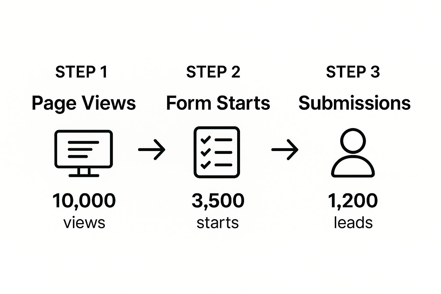
The numbers here tell a story. Attracting visitors is one thing, but getting them to actually complete the form is a whole other battle, with a big drop-off at each step. Automation is what helps you squeeze every bit of value out of every single one of those 1,200 successful submissions.
These automated touchpoints are more than just a convenience. They confirm to the user that their action worked and deliver immediate value, which builds trust and momentum right from the start. This kind of hands-off system doesn't just ensure no lead is ever left hanging; it frees up your team to do what they do best: build relationships and close deals, not get bogged down in administrative busywork.
Advanced Strategies for Lead Capture Channels

If your only lead capture mechanism is a static 'Contact Us' page, you're leaving a ton of high-intent leads on the table. The real wins come from meeting prospects where they already are and when they're most engaged. This means going beyond your website with a strategy that includes dynamic, on-site methods and powerful off-site channels.
On-site, we're talking about things like pop-ups, slide-ins, and even full-screen overlays. I know, I know—they have a reputation for being annoying. But when you get the context and timing right, they're incredibly effective. An exit-intent pop-up that offers a last-minute discount can be the difference-maker for a visitor about to bounce. Or, think about a slide-in form that appears after a user scrolls 70% down a blog post. You're presenting a relevant offer precisely when their interest is at its peak.
Go Beyond Your Website with Off-Site Lead Capture
Let's be honest, your most valuable prospects aren't spending all their time on your website. They're on other platforms, and capturing leads directly on those networks is a game-changer. It removes friction and uses the native experience of that platform to your advantage.
For B2B marketers, this is where channels like LinkedIn Lead Gen Forms become an absolute goldmine.
These forms are brilliant because they pre-populate a user's information straight from their LinkedIn profile. Think about it—the effort to submit drops to virtually zero. This seamless experience translates into massive results. LinkedIn Lead Gen Forms hit an average conversion rate of 13%. That's more than five times higher than the typical 2.35% you see on standard website landing pages. It's no surprise that 40% of marketers call it their top channel for high-quality leads.
The future of lead capture isn't about dragging everyone back to your website. It's about creating frictionless conversion points inside the platforms your audience already knows and trusts.
Turn Passive Browsing into Active Engagement
The days of static forms that just take, take, take are numbered. The most effective lead capture forms today are interactive. They give the user immediate value in exchange for their contact details, turning a simple data-collection tool into a memorable brand experience.
By their very nature, interactive forms build goodwill and help pre-qualify your leads. Someone who takes the time to go through a multi-step assessment is almost certainly a more serious prospect than someone who just grabs a PDF.
Here are a few powerful examples of interactive lead capture in action:
- ROI Calculators: Let a prospect plug in a few numbers about their business and instantly see the potential financial return of using your solution. It's a powerful way to demonstrate value right away.
- Quizzes or Assessments: A well-designed quiz can help a user diagnose a problem or understand their own maturity level in a certain area, positioning you as a helpful expert from the first interaction.
- Webinar Sign-ups: These forms do more than just collect an email; they secure a time commitment. You're getting a prospect to agree to engage with your brand for an extended period, which generates some of the highest-quality leads you can find.
When you offer value upfront, you naturally attract more engaged and better-qualified prospects. It shifts the entire dynamic from "give us your info" to "let us help you figure this out," which is a much healthier way to kick off a customer relationship. For those wanting to push this even further, exploring some of the top AI tools for lead generation can open up new channels and automate a lot of this heavy lifting.
Of course, even with the best-laid plans, questions are going to pop up. When you're dealing with something as make-or-break as a lead capture form, a tiny bit of doubt can tank your conversion rates. This section is all about tackling those common "what if" scenarios and tricky questions that marketers run into every single day.
Let's get you some clear, straightforward answers to the challenges that often lead to analysis paralysis. The goal is to help you push past those last few hurdles and start refining your forms with real confidence.
How Many Fields Should a Form Have?
This is the million-dollar question, isn't it? The answer is always a bit of a balancing act: as few as possible, but as many as necessary. There's no magic number here. The right amount of fields is completely tied to the value of what you're offering and where that person is in their journey with you.
For something at the top of the funnel, like a simple newsletter sign-up, just asking for an email address is usually your best bet. The barrier to entry is rock-bottom, which is exactly what you want to maximize subscriptions.
But for a high-intent, bottom-of-funnel action like a demo request, you need more intel to qualify the lead and get them to the right sales rep. Your sales team can't do much with just an email. For these more serious forms, a good starting point is usually 3-5 fields—think name, work email, company name, and company size.
Here's the golden rule: always be testing. Try lopping off just one field from your form and see what happens. If your conversion rate jumps without a major hit to lead quality, you've just found a quick win.
Should I Use a Single-Step or Multi-Step Form?
Multi-step forms are a fantastic way to handle longer, more involved information gathering without scaring people off right away. They work so well because they reduce that initial friction and tap into a powerful psychological trigger called the "sunk cost fallacy."
You start by asking for something simple and non-threatening, like a name or email. Once someone has made that tiny initial commitment, they're psychologically wired to want to finish the process, even if the next steps ask for more detailed info like a phone number or budget.
This makes multi-step forms a no-brainer for situations like:
- Quote Requests: Gathering project details can feel like a chore, but breaking it down into smaller bites makes it feel way more manageable.
- Event Registrations: Collecting attendee info, session choices, and payment details is much smoother when done in stages.
- Complex Applications: Whether it’s for a loan or a special program, separating personal, financial, and other details into steps is far less intimidating.
On the flip side, a single-step form is perfect for those quick, low-commitment actions where all the required fields can be seen at once without causing immediate overwhelm.
What Is the Best Call-to-Action Text?
Your call-to-action (CTA) button is the grand finale. Using generic, boring text like "Submit" or "Download" is a huge missed opportunity. It’s totally uninspiring and does nothing to remind the user of the value they're about to get.
Instead, your CTA needs to use action-oriented language that spells out the benefit from the user's point of view. It should feel like the natural end to the sentence, "I want to..."
Here's how you can reframe your CTAs for much better results:
| Instead of This... | Try This... | Why It Works |
|---|---|---|
| Submit | Get My Free Guide | It reinforces the value (a guide) and adds ownership ("My"). |
| Download | Start My Free Trial | It focuses on the action and the immediate benefit (a trial). |
| Sign Up | Reserve My Spot | It creates a sense of urgency and makes the offer feel exclusive. |
The best CTAs are specific, benefit-driven, and perfectly match the offer on the page. They leave zero doubt in a person's mind about what’s going to happen when they click.
How Important Is Form Placement on a Page?
Placement is critical. You can have the most beautiful, well-designed form in the world, but if nobody sees it, it’s not going to convert. You need to put your form in front of the user at the exact moment their intent is at its peak.
For dedicated landing pages where the only goal is to capture a lead (like a webinar registration page), the form should always be "above the fold." That means it's clearly visible without any scrolling. This puts the main action front and center the moment a visitor arrives.
For longer content like blog posts or in-depth articles, you have more options. Some effective strategies I've seen work well are:
- In-Content: Placing a relevant form right in the body of the text, directly related to the topic at hand.
- End of Post: This is a logical spot to catch readers who just finished your article and are thinking, "What's next?"
- Slide-in or Pop-up: Triggering a form based on behavior, like scrolling 70% down the page or showing exit intent, can be a great way to grab attention without being too annoying.
Ready to stop letting qualified leads slip through the cracks? Distro transforms your demo request forms into a conversion engine. Our intelligent routing instantly connects high-intent prospects to the right sales rep's calendar, eliminating response delays and dramatically shortening your sales cycle. See how teams using Distro achieve 3X higher conversion rates.