
That lead capture form on your website? It’s not just a box with a few fields. It's the front door to your business, the digital handshake where a potential customer decides if they want to step inside or just walk on by. Nailing this one element is mission-critical; it sets the tone for the entire customer relationship from the very first click.
Why Your Lead Capture Form Is a Growth Engine
In a world where almost every business interaction starts online, a sharp lead capture form isn't just a nice-to-have—it's a core strategic asset. This is your primary way of turning anonymous website visitors into real, actionable leads for your sales team. Getting it right is the bedrock of your entire inbound strategy.
The numbers don't lie. A recent lead generation trends report found that a massive 84% of marketers count on form submissions as their main lead-gen channel. But here's the kicker: 61% of those same marketers say generating high-quality leads is their biggest headache. That disconnect tells you everything you need to know—most forms just aren't cutting it.
The Give-and-Get of a Great Form
At its core, a lead capture form is a simple value exchange. A visitor gives you their contact info, and in return, you give them something they actually want.
This could be:
- Valuable Content: An insightful ebook, a data-packed whitepaper, or a seat at an exclusive webinar.
- Direct Engagement: A personalized product demo, a no-obligation consultation call, or a custom quote.
- Exclusive Offers: A juicy discount code, early access to a new feature, or an entry into a giveaway.
This simple trade is the first step in building trust. It’s your chance to prove you understand their problem and have the solution.
A lead capture form isn't just about collecting data; it's the start of a conversation. Every field, every button, and every word shapes how a prospect sees your brand and whether they're willing to engage.
Before we dive deeper, let's quickly summarize the must-have elements of any form that's built to convert. These are the foundational pieces you need to get right.
Core Components of a High-Converting Lead Capture Form
| Component | Impact on Conversion | Best Practice Example |
|---|---|---|
| Compelling Headline | Grabs attention and clarifies the value proposition immediately. | "Get Your Free Marketing ROI Calculator" |
| Minimal Fields | Reduces friction and makes the form less intimidating to complete. | Asking for only "Work Email" and "First Name" for a newsletter signup. |
| Clear Call-to-Action (CTA) | Tells the user exactly what will happen next, removing ambiguity. | "Book My Demo" instead of just "Submit." |
| Social Proof | Builds trust and credibility by showing others have found value. | "Join 50,000+ marketers who get our weekly insights." |
| Privacy Assurance | Alleviates concerns about data misuse. | A simple "We'll never share your email." link to your privacy policy. |
Getting these core components right establishes a solid baseline. From here, you can start layering on more advanced strategies to not just capture leads, but to capture the right leads.
More Than Just Data Collection
An optimized form does so much more than just grab names and emails. It’s your first line of qualification. The questions you ask act as an initial filter, helping you segment leads by interest, company size, or role before they even hit your CRM.
Think about it. Asking for "Company Size" lets you instantly send an enterprise-level lead straight to a senior account executive. Meanwhile, a smaller lead from a startup could be funneled into an automated email nurture sequence. This kind of initial sorting is a game-changer for efficiency, making sure your most valuable prospects get the white-glove treatment right away.
When you stop seeing your form as a simple data-entry tool and start treating it like a strategic part of your sales funnel, you unlock its true potential. You won't just get more leads—you'll get better leads who are primed to become loyal customers.
Designing a Form People Actually Want to Fill Out

A great lead capture form shouldn't feel like an interrogation. It needs to feel more like the start of a natural conversation. There's a common myth that shorter is always better, but that's not the whole story. The real goal is to reduce cognitive load—basically, how much mental energy someone has to spend to fill out your form.
Think about it this way: a cluttered, messy room is mentally exhausting to deal with. A clean, organized one isn't. Your forms work the same way. Smart design choices can make even a longer form feel simple and intuitive, which means more people will actually complete it. In fact, one study found that 26% of users will ditch a form simply because it's too long or confusing.
Create a Visually Appealing Layout
First impressions count, big time. If your form looks like a wall of text and boxes, people will bounce immediately. Your job is to create a clean, inviting layout that’s easy to scan.
White space is your most important tool here. It breaks up the form, guides the eye, and keeps things from feeling cramped. I always recommend using a single-column layout. It creates a clear, straight line for the user to follow, which is a lifesaver on mobile where screen space is tight.
Also, pay close attention to your field labels. Put them above the input fields. Don't use placeholder text for labels. That text vanishes the second someone starts typing, forcing them to guess what they were supposed to enter. This one tiny change makes a massive difference in usability.
The Power of Multi-Step Forms
If you need to ask for more than just a name and email, break it up. A multi-step form is almost always the way to go. Instead of hitting someone with ten fields all at once, you can split the request into smaller, more manageable chunks.
This works so well because of a few psychological tricks:
- The Foot-in-the-Door Technique: Once someone fills out that first simple step (like their email), they’ve already made a micro-commitment. They're much more likely to finish what they started.
- Reduced Initial Overwhelm: A form that only asks for one or two things upfront feels way less intimidating.
- A Clear Sense of Progress: A progress bar is a game-changer. It shows people exactly where they are and how much is left, managing their expectations and slashing abandonment rates.
A multi-step lead capture form transforms a daunting task into a series of simple, manageable actions. It respects the user's time and attention, making them feel in control of the process, not overwhelmed by it.
Think about signing up for a SaaS trial. Step one might just ask for your work email. Easy enough. Step two could ask for your company size, and the final step might ask about your goals. Each step feels small and achievable on its own.
Use Conditional Logic to Personalize the Experience
Why waste someone's time with questions that don't apply to them? Conditional logic is a killer feature that dynamically changes the form based on previous answers. It makes the experience feel smarter, more personal, and a whole lot faster.
For instance, if a lead selects "Marketing" as their department, you can show a follow-up question about their biggest marketing challenge. If they had chosen "Sales," you could show a completely different field asking about their team size.
This approach nails two crucial goals:
- It shortens the form for every individual user by hiding fields that aren't relevant to them.
- It helps you gather highly targeted data, giving your sales team the exact context they need for a productive conversation.
By focusing on the user's experience, you can build a lead capture form that people don't just put up with—they find it genuinely easy to complete. For some real-world inspiration, check out these high-converting contact form examples to see these principles in action.
Crafting an Offer That Maximizes Submissions

Let's be honest. You could build the most beautiful, streamlined lead capture form in the world, but if the offer stinks, it's dead on arrival. The offer is everything. It's the core reason someone decides to trade their precious contact info for whatever you're promising.
It’s where you have to answer their silent, skeptical question: "What's in it for me?"
If you dangle a generic offer, you'll get generic, low-quality leads. A great offer, on the other hand, clicks perfectly with where your visitor is right now in their buying journey. It’s the difference between someone grabbing a freebie they’ll forget in five minutes and someone eagerly booking a demo because they see a real solution to a real problem.
Aligning the Offer with User Intent
Think of the buyer's journey like a road trip. Some people are just starting to realize they need to go somewhere—they're looking for a map. Others are pulling up to their destination, looking for a specific street address. Your offers need to meet them where they are.
Top of Funnel (Awareness): These folks are just figuring out they have a problem. A hard sales pitch will just scare them away. Instead, offer them something educational and low-risk. We're talking insightful ebooks, original industry data, or comprehensive guides that help them name the pain they're feeling.
Middle of Funnel (Consideration): Okay, now they're actively looking for solutions. They know the problem and they're weighing their options. This is prime time for webinars, in-depth case studies, or even simple comparison sheets. These assets help them see how you stack up and imagine your solution in action.
Bottom of Funnel (Decision): These prospects are on the verge of buying. They just need that final nudge that proves you're the right choice. Product demos, free trials, or personalized consultations are your heavy hitters here. These are high-intent actions that scream, "I'm ready to talk business."
Choosing the Right Lead Magnet
The term "lead magnet" always sounds a bit clinical to me, but the principle is solid. You need a compelling reason for someone to fill out your form. The secret sauce is relevance. A whitepaper on SEO strategy is completely useless to an audience of HR managers.
Let's make this real. Imagine a SaaS company selling project management tools. A top-of-funnel visitor lands on a blog post, "5 Signs Your Team's Workflow is Broken." The perfect offer here isn't a demo—it's a downloadable checklist: "The Ultimate Project Kickoff Checklist." It’s directly related, instantly valuable, and only asks for an email. Simple.
Now, picture someone else browsing your product feature page. They're way further down the path. A CTA for a checklist would feel like a step backward. For them, an offer to "Watch a 5-Minute Demo Video" or "Get a Custom Price Quote" connects directly with their immediate goal: evaluating your software. This kind of targeted approach is a pillar of successful inbound lead generation, ensuring you're not just collecting emails, but starting meaningful conversations.
A great offer feels less like a transaction and more like the first step in a helpful partnership. It demonstrates that you understand the user's immediate needs and are equipped to solve their bigger challenges down the road.
Testing and Iterating Your Offers
Newsflash: you probably won't nail the perfect offer on your first attempt. I've seen it time and again—what you think is a game-changer might not land with your audience. This is exactly why A/B testing is non-negotiable.
And I'm not just talking about testing the color of your CTA button. Test the offer itself. On a key landing page, pit one asset against another and see which one actually moves the needle on form submissions.
Here's a simple test you could run:
- Offer A (Control): "Download Our Free Ebook: The State of Sales Automation"
- Offer B (Test): "Sign Up for Our 30-Minute Webinar on Sales Automation Trends"
You might find your audience craves the interactive Q&A of a webinar, or maybe they prefer a static ebook they can read on their own time. Running these tests gives you cold, hard data on what your audience actually values. It lets you stop guessing and start building a strategy that consistently boosts the performance of every lead form you create.
Supercharge Forms with Smart Routing and Automation
So, a visitor just filled out your perfectly crafted lead capture form and hit "submit." The hard part's over, right? Not even close.
What happens in the first few minutes after that click is arguably more important than everything that led up to it. This is where your form connects to your business engine, and believe me, speed is the name of the game.
Without a smart system, that lead just sits in an inbox, waiting for someone to manually assign it. By the time it finally reaches the right salesperson, the lead's initial excitement has completely fizzled out. An immediate, intelligent routing system is the bridge between a hot lead and a cold trail.
Why Immediate and Intelligent Routing Matters
Think of a new lead like a 911 call for your sales team. You wouldn't put an emergency call on hold. The exact same urgency applies here.
This is where intelligent lead routing, like the system we’ve built at Distro, comes in. It automatically sends new leads to the right salesperson—in seconds—based on rules you define.
But this isn't just about speed; it's about precision. You can set up custom rules to ensure every lead is a perfect match for the rep who gets it.
Here are a few common routing scenarios we see all the time:
- Territory-Based Routing: A lead from California is instantly sent to your West Coast sales rep. Simple.
- Company Size: An enterprise lead (500+ employees) goes straight to a senior account executive, while a startup lead is assigned to a team focused on SMBs.
- Product Interest: If your form asks which product they're interested in, the lead can be routed to a specialist for that specific product line.
This level of automation completely eliminates manual work and ensures your highest-value prospects get a white-glove experience from the very first moment. This infographic shows how optimizing your form's CTA is the very first step in this high-velocity process.
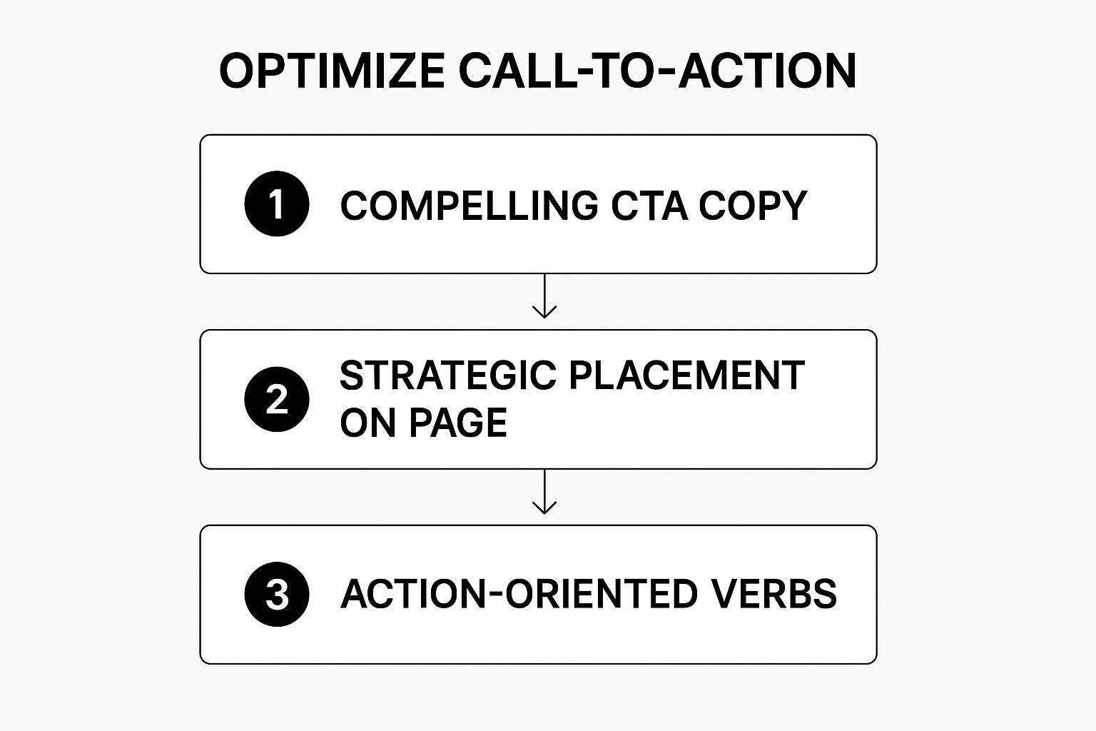
As the graphic shows, a powerful call-to-action is the trigger for the entire post-submission workflow. That makes a seamless handoff to your routing system absolutely critical.
Beyond Routing: Triggering Personalized Follow-Up
Capturing a lead is only the beginning. The real goal is to start a meaningful conversation and build a relationship. Integrating your lead capture form directly with your CRM and marketing automation tools is how you make this happen at scale.
When a lead is submitted and routed, it should simultaneously trigger a series of automated, yet personalized, actions.
An automated follow-up sequence ensures no lead ever falls through the cracks. It maintains momentum and keeps your brand top-of-mind while your sales team prepares for their outreach.
For instance, the moment a lead is assigned, your system can:
- Send an immediate confirmation email. This reassures the lead their request was received and tells them what to expect next.
- Add the lead to a specific nurture sequence. If they downloaded an ebook on marketing analytics, they can be added to an email drip campaign focused on that topic.
- Create a task in the CRM. This prompts the assigned salesperson to follow up within a specific timeframe, ensuring accountability.
This automated workflow guarantees a consistent and professional experience for every single lead, no matter their source or value. If you're looking to refine your own process, exploring our guide on lead routing best practices can provide a solid framework.
The Critical Role of Nurturing
It's tempting to think every lead is ready to buy right now, but the data tells a different story. The number of touchpoints needed for a conversion varies dramatically. While some warm leads might convert after 5-12 interactions, colder prospects could require up to 50 touches.
Given that lead generation is a top priority for 34% of companies, it’s shocking that an estimated 80% of leads never convert into sales—often due to a lack of proper follow-up. You can read more about these lead generation statistics and their implications to understand the full scope of the challenge.
This is precisely why connecting your lead capture form to a robust automation and routing engine is so essential. It doesn't just collect information; it activates your entire sales and marketing ecosystem.
By delivering the lead to the right person instantly and kicking off a personalized nurture sequence, you dramatically increase the odds of turning that initial spark of interest into a closed deal. You're not just collecting data—you're starting a relationship on the right foot.
Analyzing Performance and Optimizing for Conversion
Hitting "publish" on your lead capture form isn't the finish line. It's the starting pistol. The real wins come from treating your form like a living, breathing part of your marketing—something you constantly poke, prod, and improve. It’s this culture of testing and tweaking that turns small, consistent changes into huge gains in lead volume and quality.
https://www.youtube.com/embed/zjRY685UzsM
This means you have to stop guessing. Gut feelings are great for a lot of things, but optimizing a form isn't one of them. You need to let the data tell you what's working and, more importantly, what's falling flat. Without a clear picture of your form's performance, you’re flying blind and leaving good leads on the table.
Key Metrics to Track
Before you can fix anything, you have to know what's broken. It's easy to get lost in a sea of analytics, so my advice is to zero in on the handful of metrics that actually move the needle. These are the numbers that tell you a clear story about what your visitors are doing.
Your main focus should be on these three heavy hitters:
- View-to-Submission Rate (Conversion Rate): This is your form’s pulse. Of all the people who saw your form, what percentage actually filled it out and hit submit? It’s the ultimate health check.
- Form Abandonment Rate: This is the flip side of your conversion rate. It tells you how many people started filling out your form but bailed before finishing. A high abandonment rate is a massive red flag.
- Field Drop-Off Rate: Which specific field is making people quit? Most analytics tools can pinpoint the last field a user touched before they abandoned the form. This is absolute gold for finding friction points.
Tracking these gives you a powerful diagnostic tool. If you see a huge drop-off on the "Phone Number" field, for instance, it’s a pretty clear signal that your ask is too big for the value you're offering at that moment.
The Art of the A/B Test
Once your metrics point to a problem, it's time to find a solution. This is where A/B testing (or split testing) becomes your best friend. The idea is simple: you run two versions of your form—an A version (the control) and a B version (the test)—to see which one performs better.
The golden rule of A/B testing? Only change one thing at a time. If you change the headline, the button color, and the number of fields all at once, you’ll have no clue which change actually moved the needle.
Start by creating a clear hypothesis. Something like: "We believe changing the CTA from 'Submit' to 'Get My Free Guide' will boost conversions because the new copy is more specific and value-driven." Then, you let the test run until you have a statistically significant winner.
An effective A/B testing program isn't about finding some mythical "perfect" form. It's about building a continuous feedback loop where you're always learning, always iterating, and always improving your lead capture process.
Optimizing your forms is more important than ever, especially when you look at how fast the lead generation market is growing. The industry was valued at around $5.59 billion in 2025 and is projected to explode to $32.1 billion by 2035. This growth is being driven by better data analytics, making performance analysis a non-negotiable part of the game.
A/B Testing Ideas for Your Lead Capture Form
Not sure where to start your testing journey? The possibilities are pretty much endless, but from my experience, some elements just have a bigger impact than others.
Here's a quick cheat sheet with some high-impact areas to focus your A/B tests on first.
| Element to Test | Variable A (Control) | Variable B (Test) | Metric to Measure |
|---|---|---|---|
| Headline | "Contact Us" | "Get a Free Demo Today" | Form Conversion Rate |
| Call-to-Action Text | "Download Now" | "Send Me the Ebook" | Submission Rate |
| Number of Fields | 5 Fields (incl. Phone) | 3 Fields (excl. Phone) | Abandonment Rate |
| Form Layout | Two-Column Layout | Single-Column Layout | Completion Time |
This table gives you a solid starting point for building your own testing roadmap.
Every little improvement you make adds up to a better overall lead-to-sale conversion rate. Small wins compound over time. To really dig in and find out why people are dropping off, consider using tools like survey templates designed to identify sign-up barriers. These can give you the qualitative "why" behind the quantitative "what," giving you a complete picture and paving the way for truly meaningful improvements.
Common Questions About Lead Capture Forms

Even with a perfect plan on paper, a few specific questions always seem to surface when you're in the trenches building or tweaking a lead capture form. I've seen these same debates pop up time and time again.
This section is all about giving you direct, no-fluff answers to those common sticking points. Think of it as your go-to guide for making smarter decisions when you're on the clock.
How Many Fields Should My Form Have?
Ah, the million-dollar question. The honest-to-goodness answer? There is no magic number. It's all about striking a delicate balance.
Your sales team needs enough info to qualify and follow up effectively, but every extra field you add increases the chance someone will just give up and leave. The data doesn't lie: research shows a staggering 26% of users will abandon a form just because it looks too long or complicated.
The best way to approach this is to start with the absolute bare minimum. What information do you truly need to get the ball rolling? For a newsletter signup, a work email is probably all you need. For something higher-intent like a demo request, you’ll likely need a name, email, company, and maybe company size.
Treat every single field as a point of friction. For each one, ask yourself:
- Is this absolutely essential for the initial conversation? If not, you can always gather more data later on.
- Will adding this field improve lead quality enough to risk losing a chunk of total conversions?
- Could I get this info from a data enrichment tool instead of making the user type it out?
Ultimately, the only way to find your sweet spot is to test. Let your A/B testing data and analytics tell you what works for your audience and your offer.
Should I Use a Single-Step or Multi-Step Form?
This choice really boils down to one thing: the complexity of your ask.
For low-friction requests, a single-step form is your best friend. I'm talking about simple newsletter subscriptions or basic contact forms where you only need a couple of pieces of information. They're quick, clean, and get the job done without any fuss.
But the moment you need more detailed info, the multi-step form becomes a powerhouse. Why? Because breaking a long, intimidating form into smaller, digestible chunks dramatically reduces the psychological burden on the user.
This taps into a powerful psychological principle called the "foot-in-the-door" technique. Once a user completes a simple first step (like just entering their email), they've made a micro-commitment. This makes them significantly more likely to follow through and complete the rest of the form.
Pairing a multi-step form with a progress bar is a pro move. It gives users a sense of accomplishment and control, turning what could be a chore into a series of easy wins. For more complex data collection, this almost always crushes single-step forms in terms of completion rates.
What's the Best Placement for a Form?
Where you put your form is just as critical as its design. The right spot depends entirely on the page's goal and what the user is thinking at that exact moment. You always want to present the form at the point of highest intent.
Here are a few placement strategies I’ve seen work wonders:
- On a Dedicated Landing Page: Here, the form is the star of the show. Placing it "above the fold" (visible without scrolling) is a classic for a reason—it’s the very first thing your visitor sees.
- In a Blog Post: An inline form, placed right after you've delivered a powerful insight or a compelling stat, can be incredibly effective. You've just provided value; now is the perfect time to ask for something in return.
- As a Slide-In or Popup: You have to be careful with these to avoid being annoying, but a well-timed slide-in triggered by scroll depth or an exit-intent popup can grab attention without derailing the user's experience.
Whatever you do, don't just shove a form in the sidebar and hope for the best. Be strategic. Think about the user's journey on that specific page and place your lead capture form where it feels like a natural and helpful next step, not a jarring interruption.
How Can I Reduce Form Abandonment?
A high form abandonment rate is a massive red flag. It’s a clear signal that there's friction somewhere in your process. The good news is that most of the causes are entirely fixable. If you're seeing a lot of people start but not finish your forms, it's time to run some diagnostics.
Start by investigating these usual suspects:
- Mobile Experience: This is non-negotiable. Is your form a dream to use on a smartphone? If users have to pinch and zoom to fill out fields, you're hemorrhaging leads. Guaranteed.
- Unclear Field Labels: Use crystal-clear labels and place them above each field. A common mistake is using placeholder text as a label, which vanishes the second a user starts typing, forcing them to guess.
- No Instant Feedback: Implement inline validation. Little things like a green checkmark for a valid email or a red error message for a mistake provide incredibly helpful real-time feedback and reduce frustration.
- Privacy Concerns: A little reassurance goes a long way. A simple message like "We respect your privacy" near the submit button or a link to your privacy policy can ease a user's anxiety.
- Weak Value Proposition: Finally, take a hard look at your offer itself. Is it compelling enough to make filling out the form worth it? Make sure the value is stated clearly and concisely right next to the form.
By methodically working through these potential friction points, you can effectively plug the leaks in your funnel and get more visitors to successfully hit "submit."
Ready to stop leads from getting lost in a messy inbox and start converting them instantly? Distro connects to your forms and automatically routes every lead to the right salesperson's calendar in seconds. See how you can triple your demo request conversions at https://distro.so.