In today's competitive market, attracting traffic is only half the battle. The real challenge lies in converting that hard-won attention into tangible business outcomes: leads, sales, and loyal customers. Every visitor who leaves your site without taking action represents a missed opportunity and wasted marketing spend. This is where Conversion Rate Optimization (CRO) becomes your most valuable asset. It is the systematic process of improving user experience to turn more visitors into customers.
This isn't just about tweaking button colors or changing a headline. To truly maximize your website's potential, begin by understanding what conversion optimization truly entails, setting the stage for a strategic approach. It requires a methodical examination of every touchpoint in the user journey, from the moment a user lands on your page to the final click of a "submit" button. For sales and marketing teams, this process is not optional; it's essential for accelerating lead conversion, optimizing the sales pipeline, and proving ROI.
To help you transform your digital properties into a conversion machine, we've developed the ultimate conversion optimization checklist. This guide moves beyond generic advice to provide a comprehensive, step-by-step roundup of seven critical areas that demand your focus. We'll dive deep into high-impact tactics for:
- Landing Page Optimization
- Call-to-Action (CTA) Design
- Form Simplification
- Page Load Speed
- Trust and Social Proof
- Mobile Experience
- Value Proposition Clarity
Each section is packed with actionable strategies, practical implementation tips, and real-world examples, giving you a clear roadmap to stop leaving money on the table and start boosting your bottom line. Let's begin.
1. Landing Page Optimization
Landing page optimization is the cornerstone of any successful conversion optimization checklist. It’s the systematic process of refining every element on a dedicated page to guide a visitor toward a single, specific action. Your landing page is often the first direct interaction a potential customer has with your offer after clicking an ad or a link. This makes it a critical, make-or-break moment in the customer journey.
The goal is to eliminate friction and create a persuasive, seamless path from visitor arrival to conversion. This involves aligning every component, from the headline and imagery to the call-to-action (CTA) and form fields, with the visitor's intent and expectations set by the initial traffic source. When done correctly, an optimized landing page doesn't just present an offer; it builds trust and convinces the user that taking the next step is in their best interest.
Actionable Optimization Tips
To transform your landing pages into high-performing conversion assets, focus on these specific, high-impact strategies:
- Message Match Your Headline and Ad Copy: The headline on your landing page must directly reflect the promise made in the ad that brought the visitor there. If your ad promises a "Free Ebook on SEO Trends," your landing page headline should be nearly identical. This reassures visitors they are in the right place, immediately reducing bounce rates.
- Simplify Your Forms: Only ask for the information you absolutely need. Every additional field you require creates friction and can lower your conversion rate. For an initial lead capture, a name and email address are often sufficient. You can always gather more information later in the funnel.
- Use High-Contrast CTAs: Your call-to-action button should be impossible to miss. Use a color that stands out from the rest of the page's color scheme. For example, if your page uses blues and whites, an orange or green button will draw the eye.
- Leverage Social Proof: Incorporate testimonials, case study snippets, or logos of well-known clients. Seeing that others have found value in your offer significantly increases trust. For instance, HubSpot famously improved conversion rates by 24% just by adding video testimonials.
The infographic below highlights the tangible results you can achieve through focused landing page optimization.
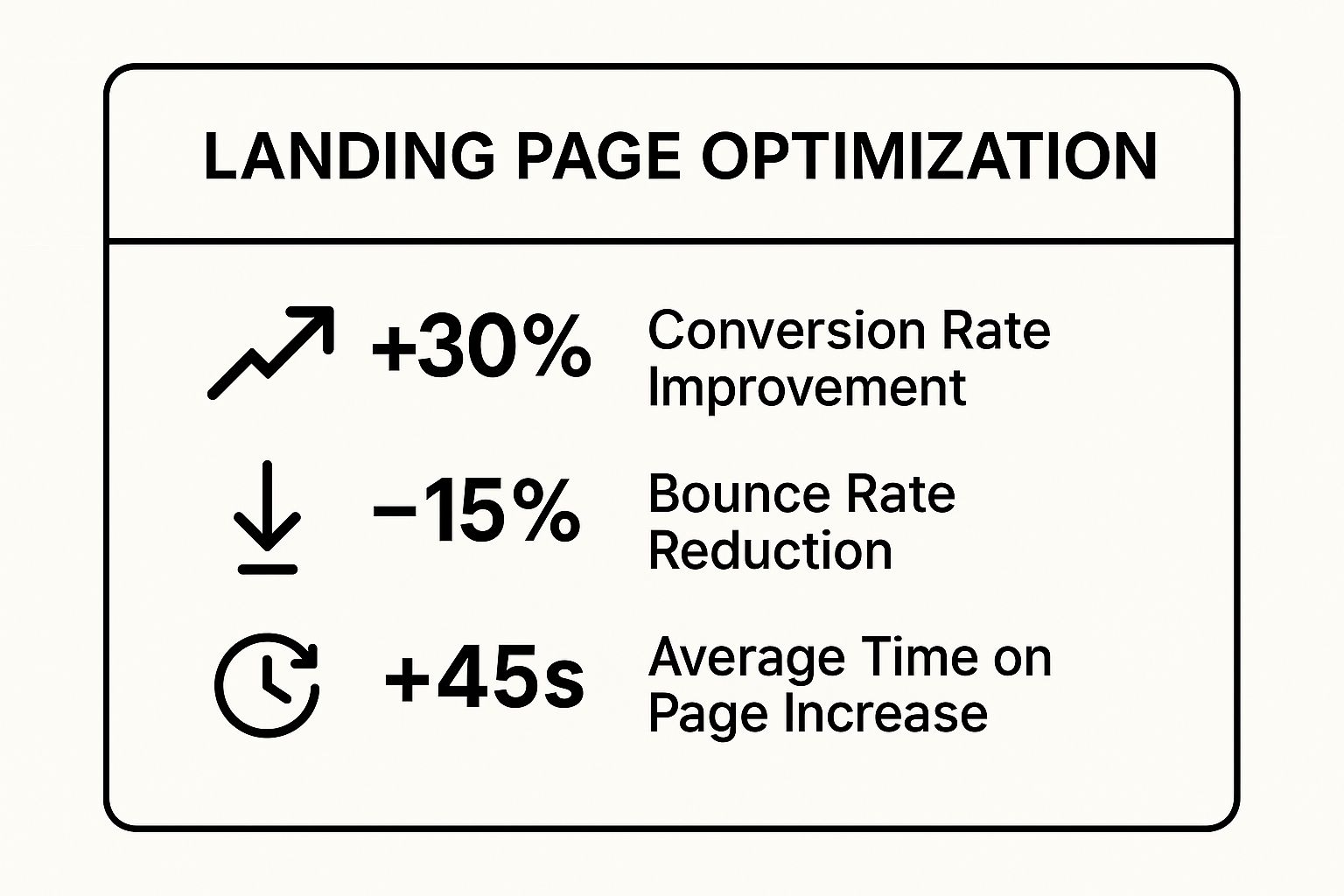
As the data shows, these efforts lead to direct improvements in key performance indicators that signal a healthier and more effective marketing funnel. Understanding the various kinds of pages you can build is a great next step; you can learn more about the different types of landing pages to see which format best suits your campaign goals.
2. Call-to-Action (CTA) Optimization
Call-to-Action (CTA) optimization is a critical component of any conversion optimization checklist, focusing on the strategic design, wording, and placement of the buttons and links that prompt user action. Your CTA is the gateway to conversion; it's the final instruction that tells a user what to do next. Whether it's "Buy Now," "Download Ebook," or "Request a Demo," this element must be compelling, clear, and persuasive.
The goal is to remove any hesitation or confusion at the moment of decision. Optimizing a CTA involves a deep dive into its visual and psychological components, from the color and size of the button to the action-oriented language it uses. An effective CTA doesn't just ask for a click; it communicates value and creates a sense of urgency, making the user feel that clicking is the logical and beneficial next step.

Actionable Optimization Tips
To turn your CTAs into powerful conversion drivers, implement these specific, data-backed strategies:
- Use First-Person, Value-Driven Copy: Frame the CTA from the user's perspective. Instead of the standard "Get Your Free Trial," test "Get My Free Trial." This subtle shift to first-person language can create a stronger sense of ownership and personal relevance. For example, ContentVerve famously boosted conversions by 90% simply by adding the value proposition "It's free" to their CTA button.
- Place CTAs at Natural Decision Points: Your primary CTA should be visible above the fold, but don't stop there. Place additional CTAs at natural conclusion points in your content, such as after a compelling argument or at the end of a section. This ensures users have an opportunity to convert whenever they feel ready, without having to scroll back up.
- Create Visual Prominence with White Space and Contrast: Make your CTA button the most prominent, clickable element on the page. Surround it with ample white space to reduce visual clutter and draw the user's eye. Use a high-contrast color that stands out from the page's background and branding. Performable, for instance, famously improved their conversion rate by 21% by changing their button color from green to red.
- Match CTA Intensity to the Buyer's Journey Stage: A user at the top of the funnel might be hesitant to "Buy Now" but receptive to "Learn More." Tailor the commitment level of your CTA to where the user is in their journey. Use low-friction CTAs for early-stage content and high-commitment CTAs for bottom-of-funnel pages where purchase intent is strong.
3. Form Optimization
Form optimization is the critical process of refining and streamlining online forms to maximize completion rates. Every field, button, and instruction on a form represents a potential point of friction. The goal is to design a user experience that is so intuitive and effortless that it guides users to completion without hesitation. This process is a vital component of any conversion optimization checklist because forms are often the final barrier between a prospect and a conversion, whether it's for a demo request, a newsletter signup, or a purchase.
A poorly designed form can single-handedly tank your conversion rates, even if every other part of your marketing funnel is perfectly tuned. Optimizing forms involves a deep analysis of user behavior to understand where they struggle or drop off. It combines principles of user interface design, psychology, and data analysis to remove obstacles, build trust, and ensure the value exchange for providing personal information is clear and compelling to the user.
Actionable Optimization Tips
To transform your forms from conversion blockers into efficient data collection tools, concentrate on these specific, high-impact strategies:
- Minimize Form Fields: The single most effective way to improve form conversions is to ask for less information. Every field you remove reduces the user's workload and perceived risk. For example, Marketo famously increased conversions by 10% simply by reducing their form fields from nine to five. Ask yourself: what information is absolutely essential right now?
- Use Inline Validation: Provide real-time feedback as users fill out the form, rather than waiting until they hit "submit" to show an error. A green checkmark for a correctly formatted email or a red-bordered box for a mistake provides immediate guidance, reducing frustration and abandonment.
- Implement Smart Progressive Profiling: Instead of asking for all information at once, use smart forms that recognize returning visitors and present them with new fields. This allows you to gradually build a detailed customer profile over multiple interactions without overwhelming them in a single session.
- Optimize for a Single-Column Layout: For most forms, especially on mobile, a single-column layout is easier for users to scan and complete. It creates a clear, linear path from top to bottom, preventing the eye from jumping around and missing fields, which is a common issue with multi-column designs. Expedia famously boosted annual profits by $12 million just by removing one non-essential field ("Company Name") from their booking form.
Optimizing your form is a foundational step in improving your inbound lead qualification process. You can enhance your strategy by learning more about the best practices for lead capture forms.
4. Page Load Speed Optimization
Page load speed optimization involves the technical and design improvements made to reduce the time it takes for a website to fully display its content. In the context of a conversion optimization checklist, it is a non-negotiable technical foundation. With modern user attention spans shrinking, every millisecond counts. Research consistently shows that 40% of users will abandon a website that takes longer than 3 seconds to load, making speed a critical factor in retaining traffic and guiding visitors down the conversion funnel.
The core goal is to deliver a fast, frictionless user experience from the very first interaction. Slow load times frustrate users, create a poor first impression, and can directly cause them to leave before they ever see your value proposition or call-to-action. By prioritizing speed, you not only improve user satisfaction but also positively impact SEO, as search engines like Google use page speed as a key ranking factor. Big players have proven its value: Amazon calculated that a mere 100-millisecond delay could cost them 1% in sales, while Walmart found that for every 1-second improvement in page load time, their conversions increased by up to 2%.
Actionable Optimization Tips
To ensure your website’s speed is an asset rather than a liability, focus on these high-impact technical optimizations:
- Compress and Optimize Images: Large, unoptimized images are one of the most common culprits of slow pages. Use modern, efficient formats like WebP where possible, and always compress JPEGs and PNGs before uploading them. Tools like TinyPNG or ImageOptim can significantly reduce file sizes without a noticeable loss in quality.
- Leverage Browser Caching: Configure your server to tell browsers to store static files (like your logo, CSS, and JavaScript) locally. This means that on subsequent visits, the browser can load the page much faster because it doesn't need to re-download every single asset.
- Minify CSS, JavaScript, and HTML: Minification is the process of removing all unnecessary characters from your code, such as white space, comments, and line breaks, without changing its functionality. This reduces the file size of your code, allowing it to be downloaded and processed more quickly by the browser.
- Utilize a Content Delivery Network (CDN): A CDN stores copies of your website's static assets on a global network of servers. When a user visits your site, the CDN serves the files from the server geographically closest to them, dramatically reducing latency and speeding up load times for international audiences.
- Audit Your Plugins and Scripts: Every third-party script or plugin adds to your page's load time. Regularly audit what you have installed and remove anything that is not absolutely essential to your site’s core functionality or conversion goals. This includes old tracking codes, unused apps, or redundant plugins.
5. Trust Signals and Social Proof
Integrating trust signals and social proof into your website is a powerful psychological tactic in any conversion optimization checklist. This strategy involves strategically placing indicators of credibility and social validation to build visitor confidence and reduce the inherent anxiety associated with making a purchase or commitment. It operates on the principle, famously outlined by Robert Cialdini, that people tend to follow the actions and opinions of others, especially when they are uncertain.
The core goal is to reassure visitors that they are making a safe and smart choice. By showcasing that other real people and reputable organizations trust your brand, you effectively borrow their credibility. This validation can take many forms, including customer testimonials, expert reviews, security badges, money-back guarantees, and client logos. For instance, Basecamp famously boosted conversions by 102.5% simply by adding customer logos to their homepage, demonstrating the immense power of authority and peer validation.

Actionable Optimization Tips
To effectively leverage these psychological triggers, embed them thoughtfully throughout the customer journey, especially near key decision points:
- Use Specific, Detailed Testimonials: Generic praise like "Great service!" lacks impact. Instead, feature testimonials that tell a story and highlight specific benefits or results. Include full names and photos where possible to enhance authenticity. For example, ConversionXL increased conversions by a notable 12.6% just by adding customer testimonials.
- Display Real-Time Social Proof: Create a sense of urgency and popularity by showing real-time activity. Widgets that display messages like "John from New York just purchased..." or "25 people are viewing this offer right now" can significantly influence behavior by making the offer seem more desirable and time-sensitive.
- Place Trust Signals Near Conversion Points: Don't hide your trust signals. Place security badges (like SSL certificates), money-back guarantees, and third-party review ratings directly next to your "Add to Cart" or "Sign Up" buttons. This placement directly addresses last-minute friction and security concerns.
- Leverage Third-Party Platforms: Authenticity is paramount. Use reputable third-party review platforms like Trustpilot or G2 to collect and display reviews. These are perceived as more unbiased than on-site testimonials alone. Implementing visual trust signals can also be streamlined with a Trust Badge Generator to create professional-looking credibility icons.
These elements are not just decorative; they are fundamental tools of persuasion. You can discover more about the psychology behind these techniques and learn more about the different strategies of persuasion to further refine your approach.
6. Mobile Optimization
Mobile optimization is no longer an optional add-on; it's a fundamental requirement for any effective conversion optimization checklist. With a majority of web traffic now originating from smartphones and tablets, this process involves meticulously designing and refining every touchpoint of your website and funnel to provide a seamless experience on smaller screens. It goes far beyond simple responsive design, demanding a "mobile-first" mindset popularized by thought leaders like Luke Wroblewski.
The core objective is to eliminate mobile-specific friction points that frustrate users and cause them to abandon your site. This means considering how people actually use their devices, from one-handed navigation to the need for faster load times on cellular networks. A well-executed mobile optimization strategy ensures your value proposition is just as clear and compelling on a 6-inch screen as it is on a desktop monitor, directly impacting lead generation and sales. For example, O'Neill Clothing saw a staggering 65.71% increase in mobile conversions after implementing a responsive redesign.
Actionable Optimization Tips
To turn your mobile traffic into a powerful conversion engine, concentrate on these specific, user-centric strategies:
- Design for Thumb Navigation: Place key interactive elements like CTAs and menu icons within the "thumb-friendly zone" at the bottom and center of the screen. This accommodates natural, one-handed use and makes interaction effortless. Avoid placing crucial links at the top corners, which are harder to reach.
- Make Buttons and Links Tappable: Frustration builds quickly when users struggle to tap a link. Ensure all buttons and interactive elements have a minimum tap target size of 44x44 pixels, as recommended by Apple's Human Interface Guidelines. Add ample spacing between tappable elements to prevent accidental clicks.
- Simplify Forms for Mobile Input: Typing on a mobile keyboard is inherently more cumbersome. Drastically shorten your forms, only asking for essential information. Use mobile-friendly input types, like
telfor phone numbers which brings up the number pad, and enable autofill wherever possible. 1-800-Flowers boosted its mobile conversion rate by 50% primarily by simplifying its mobile checkout forms. - Leverage Mobile-Specific Features: Use features unique to mobile devices to create shortcuts for users. Implement "click-to-call" for phone numbers so users can contact you with a single tap, or "click-to-navigate" for physical addresses which opens their default maps application. These small conveniences significantly improve the user experience.
7. Value Proposition Clarity
Value proposition clarity is a foundational element of any effective conversion optimization checklist. It is the art of communicating the unique benefit a customer will receive from your product or service in a clear, concise, and compelling way. A strong value proposition instantly answers the visitor's most critical question: "Why should I choose you over anyone else?" It must grab their attention and persuade them within the first few seconds.
The core purpose is to differentiate your offering and articulate its specific value in a way that resonates deeply with your target audience's needs and pain points. When visitors land on your site, they are actively looking for a solution. A clear value proposition acts as a powerful signpost, confirming they have arrived at the right place and that your solution is uniquely equipped to solve their problem. Without this clarity, visitors are left confused and are far more likely to bounce.
Actionable Optimization Tips
To sharpen your value proposition and ensure it drives conversions, focus on articulating outcomes and unique benefits, not just features.
- Focus on Outcomes, Not Features: Customers buy results, not tools. Instead of saying your software has "AI-powered scheduling," frame it as "Automatically book qualified meetings without lifting a finger." This shifts the focus from what your product is to what it does for the customer.
- Use Customer Language, Not Jargon: Speak in the words your customers use to describe their problems. Avoid internal acronyms or technical jargon that can create a barrier to understanding. A great way to discover this language is by reading customer reviews, support tickets, and sales call transcripts.
- Test Different Value Propositions: Your audience isn't a monolith. Different segments may respond to different messaging. A/B test variations of your value proposition on key pages to see which one resonates most strongly with specific traffic sources or customer personas.
- Keep It Simple and Believable: A powerful value proposition can often be read and understood in under five seconds. As popularized by experts at the ConversionXL Institute, it must be both easy to grasp and backed by credible proof. For example, Uber's classic "The smartest way to get around" was simple, outcome-focused, and instantly understandable.
7-Point Conversion Optimization Checklist Comparison
| Item | Implementation Complexity 🔄 | Resource Requirements ⚡ | Expected Outcomes 📊 | Ideal Use Cases 💡 | Key Advantages ⭐ |
|---|---|---|---|---|---|
| Landing Page Optimization | Medium - ongoing testing and multiple variations | Moderate - design, copywriting, A/B testing | Higher conversions, improved ROI, data-driven insights | Paid ads, product launches, lead capture | Immediate conversion lift, measurable impact |
| Call-to-Action (CTA) Optimization | Low - simple changes, easy to test | Low - minor design and copy tweaks | Increased click-through and conversion rates | Buttons, links, funnel stages | Quick wins at low cost, direct conversion boost |
| Form Optimization | Medium - balancing simplicity and data quality | Moderate - UX design, validation, development | Higher form completions, better lead quality | Lead generation, signups, checkout processes | Reduces abandonment, improves data accuracy |
| Page Load Speed Optimization | High - technical and ongoing maintenance | High - development, server and CDN setup | Better UX, SEO, lower bounce rates, increased conversions | All websites needing speed and SEO improvement | Strong SEO gains, critical UX improvements |
| Trust Signals and Social Proof | Low - adding testimonials, badges, logos | Low - content creation and placement | Increased credibility and conversions | New visitors, high-risk purchase decisions | Builds trust fast, cost-effective |
| Mobile Optimization | High - responsive design and testing | High - design, development, and testing | Improved mobile conversions, SEO, user experience | Mobile-first traffic, growing mobile user base | Captures large mobile audience, future-proofing |
| Value Proposition Clarity | Medium - requires deep customer insight | Moderate - strategic messaging and testing | Clear messaging, higher relevance and conversions | New visitors, differentiation in competitive markets | Strong differentiation, immediate clarity |
From Checklist to Conversion Engine
Navigating the extensive landscape of conversion rate optimization can feel overwhelming, but it doesn't have to be a journey into the unknown. This comprehensive conversion optimization checklist has armed you with a strategic blueprint, breaking down the process into manageable, high-impact actions. We’ve moved beyond generic advice to provide a clear path forward, transforming abstract concepts into tangible steps your sales and marketing teams can implement today.
The key takeaway is that optimization is not a one-and-done project; it’s a dynamic, continuous process. Think of it less as a finite checklist to be completed and more as a perpetual cycle of improvement. Each element we’ve covered, from the split-second impression of page load speed to the psychological power of trust signals and social proof, represents a critical lever in your revenue machine. Pulling these levers in concert creates a seamless user experience that doesn't just attract visitors-it actively guides them toward becoming customers.
Synthesizing Strategy: From Clicks to Customers
The true power of this checklist is realized when you view each item not in isolation, but as an interconnected component of a larger system. Your efforts in landing page optimization and crafting compelling calls-to-action set the stage. But this initial engagement can be instantly undermined by a cumbersome, friction-filled form or a site that fails to perform on mobile devices.
Consider the synergy between these core pillars:
- Clarity and Speed: A crystal-clear value proposition combined with lightning-fast load times ensures your message is both understood and received without frustrating delays.
- Trust and Action: Powerful trust signals like testimonials and security badges build the confidence a user needs to click on your optimized CTA button and engage with your form.
- Accessibility and Experience: A flawless mobile optimization strategy guarantees that your perfectly crafted user experience is available to everyone, regardless of the device they use.
Ultimately, turning your checklist into a conversion engine requires a deep understanding of your audience, which can be gained through mastering customer journey management. When you map out and comprehend every touchpoint, from initial awareness to final purchase, you can apply these optimization principles with surgical precision, ensuring each interaction pushes the user smoothly to the next stage.
The Final, Critical Conversion: The Sales Handoff
For many B2B organizations, the most vital conversion point is the moment a high-intent prospect requests a demo. This is where all your on-page optimization efforts culminate. However, it's also where the entire process can catastrophically fail. A lead who has navigated your seamless website and is ready to talk now expects an equally fast and efficient response. Manual lead routing, scheduling delays, and back-and-forth emails create friction that kills momentum and loses deals.
This is precisely why your conversion optimization checklist must extend beyond the website and into your operational workflow. You need to automate the final, crucial step. Tools built for intelligent lead routing and instant scheduling are no longer a luxury; they are a necessity for capitalizing on the demand you've generated. By ensuring that every qualified lead is instantly connected with the right sales representative for a meeting, you close the final gap in the conversion journey. You carry the momentum from the first click all the way through to a booked meeting, dramatically increasing your chances of turning that hard-won lead into revenue. Don't let operational bottlenecks undo your marketing success. Start implementing these strategies, integrate intelligent automation, and watch your checklist transform into your most powerful and reliable conversion engine.
Ready to eliminate the final bottleneck in your conversion funnel? Distro instantly routes and schedules meetings for your highest-intent leads, ensuring no qualified prospect ever slips through the cracks. Turn your optimized web traffic into booked demos by integrating Distro today.